

Most store owners open Google Analytics, stare at a wall of numbers, and close the tab without making a single decision. The dashboard is not the problem. Nobody ever taught you what to look for. We have been setting up Google Analytics for ecommerce brands since the Universal Analytics beta more than thirteen years ago, including brands tracking millions of dollars a year in sales, and the way we read a report has almost nothing to do with scanning every metric on screen. It comes down to three questions and one skill. This post follows the video chapter by chapter, with timestamps.
How to Read Google Analytics for Ecommerce
Three questions carry almost every decision you will make in the tool. Where do your buyers come from, what do they do on your site, and what makes them buy. Acquisition answers the first, engagement answers the second, monetization answers the third. Everything else is a bonus report. But before any of them make sense, you need to know why the same number changes depending on where you look at it.
Why Your GA4 Numbers Don’t Agree With Themselves (0:33)
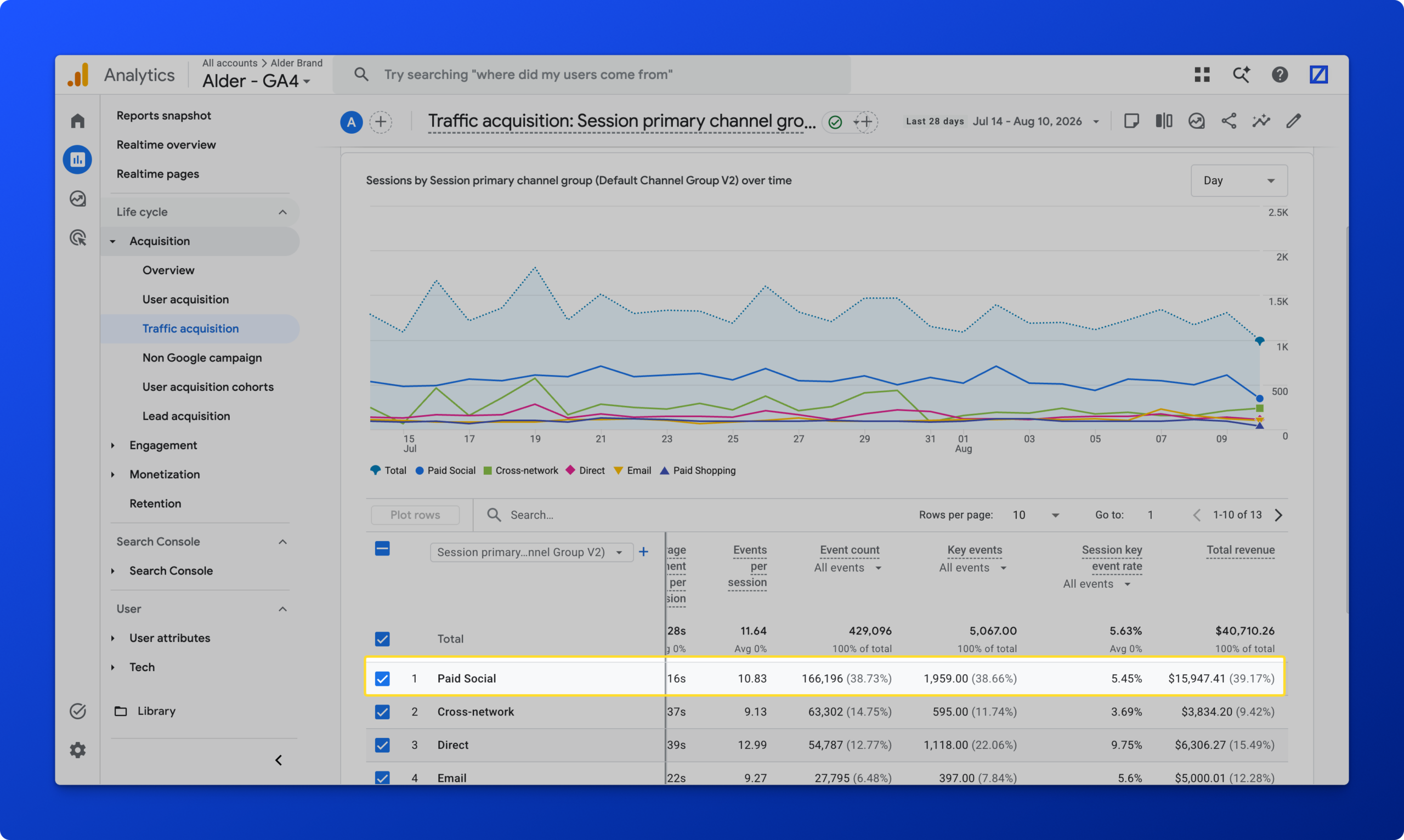
GA4 reports the same underlying data four different ways: at the event level, the session level, through channel attribution, and at the user level. Pull the same revenue through different roll-ups and the numbers flex, because the processing behind each one is doing a different job. In the walkthrough, paid social reads around fifteen thousand dollars in the session-based traffic report and closer to five thousand in the advertising report, where the data-driven model has redistributed credit, with email reading around twenty-six thousand in that same attributed view. That is not a bug. That is the feature.

Back in Universal Analytics, data-driven attribution was not even a thought, and last-click won. Whoever was last to the party took full credit. Data-driven attribution looks at time decay, frequency, and similar purchase journeys across many users, then distributes partial credit across the touches that contributed. If someone arrives from an email, comes back through social, returns direct, and then converts from a second email, the model decides how much each of those touches earned. It is a fairer read on how your marketing dollars are being stretched, and we go deeper on the mechanics in our piece on attribution models.
So match the view to the question. Session data is where you look for problems, setup gaps, and bucketing that did not account for every variation. Channel attribution is where you judge spend and channel contribution. Event counts are raw tallies, deduplicated by nothing, which is what you want when the question is how many times a thing happened. If you are tracking email signups, you do not care whether one person signed up, unsubscribed, and signed up again. You want to know whether today produced a hundred signups and how that compares to the same week last year.
Tracking Problem or Business Problem? (3:43)
This is the one skill that separates people who use GA4 from people who look at it. When something odd jumps out, take a beat before raising the alarm and ask which kind of problem you are holding: is this number strange because of how it is tracked, or because something real happened in the business?
Unassigned traffic is the everyday version of this. Revenue shows up under a channel group that should not exist, so you open an exploration and look. Some of it turns out to be AI search traffic that no channel rule was ever written for, which is a configuration cleanup, not an emergency. Some of it is genuinely unassigned, and that can be the twenty-four hour processing window, or a consent setting that only half activated, and that piece deserves a technical look. At a small share of total revenue, none of it changes a business decision today. It goes on the cleanup list and life continues.

What earns real concern is an anomaly: a whole metric falling off a cliff. A release that knocked code off the site. A CSP rule the security team activated that stopped your tags firing. Big spikes and big drop-offs are the shape of a tracking failure. Compare that with a spike in sales on the same Fourth of July you run an event every year, which is seasonality, or a trend sloping down in one place and up in another, which is customer behavior shifting and worth investigating on its own terms. Sometimes it is both at once. The habit of asking which one you are looking at is the whole skill.
Question 1: Where Your Buyers Come From (6:37)
Skip the acquisition overview. It is fine for catching a spike at a glance, but if you arrive with a business question it will not answer it. Traffic acquisition is the workhorse: every session, every way someone reached the site and interacted with it, broken out by channel group, source and medium, or campaign. One person who came through email, saw something on social, and returned in the same browser shows up as several sessions, which is exactly the granularity you want when you are diagnosing where traffic originates.
User acquisition rolls the same story up to the individual across sessions and over time, which is where new versus returning lives. For most ecommerce brands, the user and lead acquisition reports are not where the decisions get made. If you sell on a long consideration cycle, or you run a subscription model, they matter more.
Question 2: What They Do on Your Site (8:00)
Engagement covers three reports. Events is a straight physical count of everything that happened: page views, email signups, filter interactions, whatever you track. Nothing here is deduplicated. Add to cart twice on one page and you get two add-to-carts. Switch back and forth between a size or color variation and every switch lands in the report. That makes it the right place to watch quantity move over time, and the place where seasonality shows up most plainly.
Pages and screens is where GA4 asks you to change how you think. Universal Analytics framed everything as a negative: bounce rate, time on site, drop-offs. GA4 leads with the positive: engagement rate, average engagement time, how many people stayed rather than how many left. You can add the old metrics back by customizing the report, but the shift in perspective is toward what is working on the site instead of cataloging what failed.
Landing pages is the narrower cut, and it is the one place in this section that starts attributing to something other than a channel. It tells you which page began the journey and what share of revenue followed from that start. When you are pointing ads at a specific product page versus the homepage, this is where you see which entry point converts more dollars. It is a little bit first-touch, so do not overread the channel story in it. Read it as: is this page doing its job when someone arrives on it? It also pairs well with A/B tests, since you can move content around on a landing page and watch revenue attributed to that entry point respond.

Question 3: What Makes Them Buy (10:58)
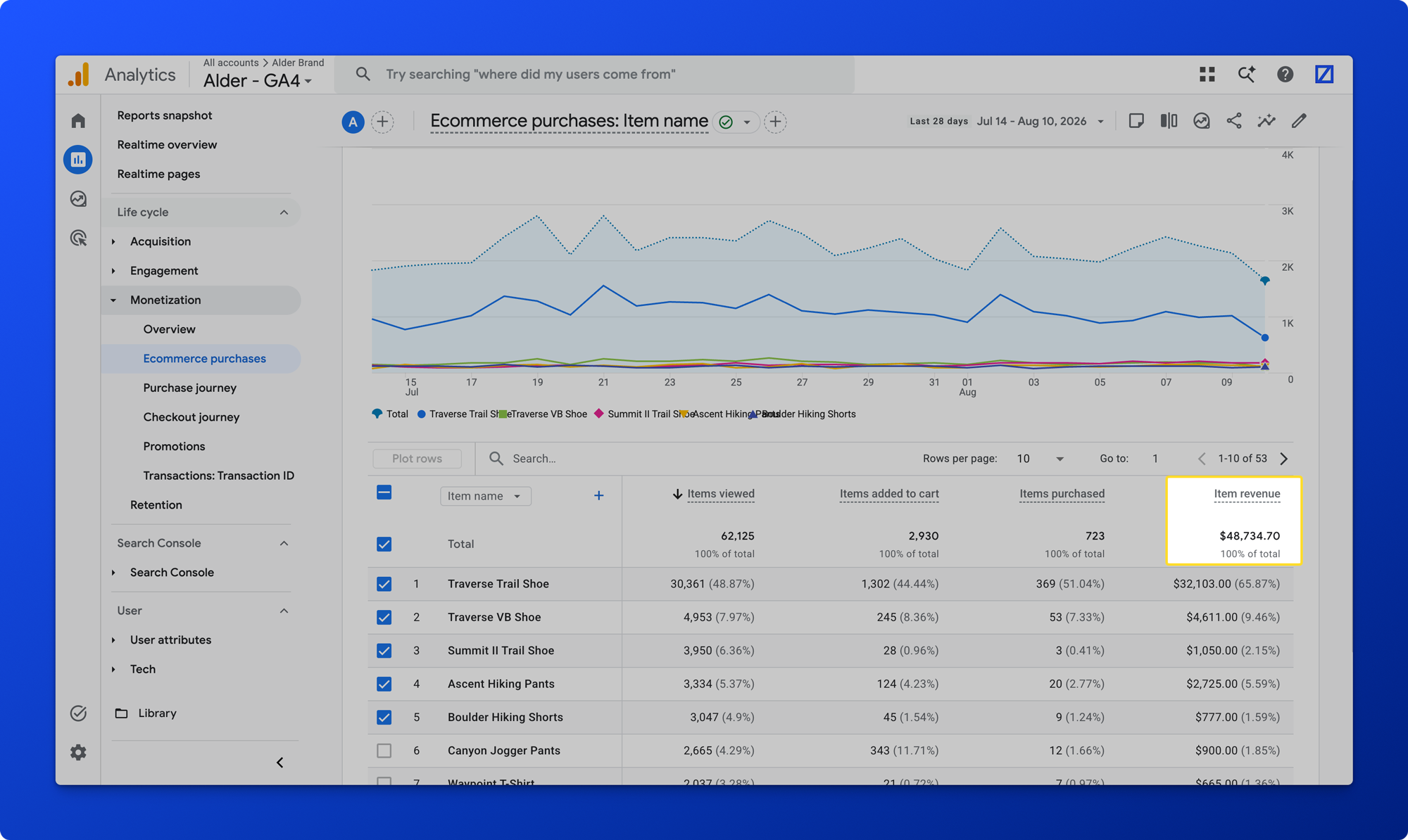
Monetization is where most people start and where most people read it wrong. Ecommerce purchases gives you item-reported revenue, which is not the same figure as your transaction revenue. If you send item-level data on the purchase event but no discount field, item revenue reads higher than the transactions. It is also a fast look at top sellers, and it is one of the numbers most likely to differ from your source system, whether that is Shopify, Salesforce Commerce Cloud, or BigCommerce, because the fall-off events on each side are different.
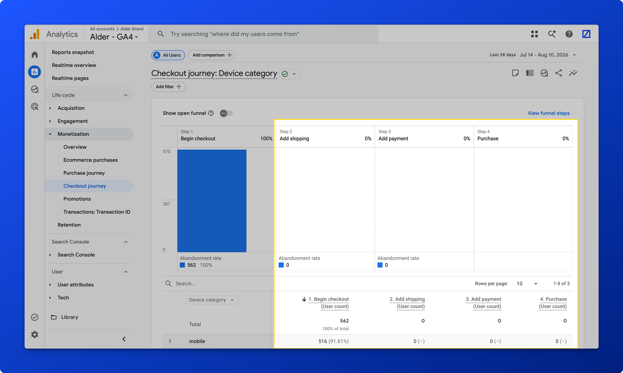
The purchase journey is the critical path across the whole site, and it needs to be configured correctly to be worth anything. Set the wrong events as key events and you will inflate engagement rates elsewhere without realizing why. The checkout journey is the same idea inside the checkout itself: begin checkout, add shipping, add payment, purchase. Zeros in those steps usually mean the events are not wired, and depending on your platform the sequence can be genuinely buggy. Either way, the strategy has to be right at setup or the report will never assemble.
Promotions is a useful section built for a site structure most ecommerce brands do not have. It is meant to connect on-site creative to the items attached to it and show whether that promotional placement converts. We usually repurpose it for asset visibility and clicks instead, and pull that into an exploration or a dashboard rather than reading revenue contribution from it. Clients running something like a shop-the-look experience are the exception, where it does the job it was designed for.
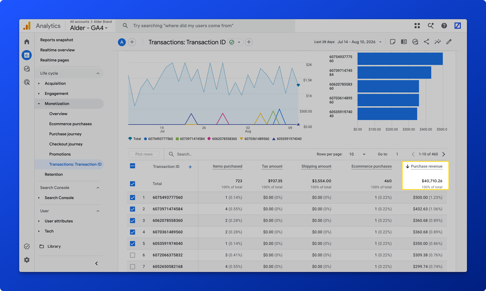
Transactions is the last one and the most underused. It shows ebbs and flows in sales cadence against your marketing calendar, and it surfaces things a summary never will: a payment method quietly failing, a strange trend in Apple Pay, or customers in Texas reaching begin-checkout and converting at a much lower rate than customers in California. That is where you start slicing.
A Real Example: The Pop-Up That Cost $7,000 a Day (14:36)
A client tested moving their email pop-up from a full-screen takeover to a small card in the bottom right. Three separate parts of GA4 caught what happened.
In acquisition, email traffic and revenue started sliding. That looks odd for a pop-up change until you remember the pop-up delivered a ten percent first-order coupon, so fewer interactions meant fewer emails going out. In events, we had already instrumented pop-up views and successful signups, and that is where we found a reporting bug between the two versions: the takeover counted a signup for everyone who submitted, including people already subscribed, while the card counted only net-new subscribers. Same event name, two different definitions, which would have made a naive comparison meaningless. Then in the purchase journey and transactions, we could count how many orders carried a new-subscriber coupon from the pop-up versus the footer, the checkout, or a social post.
Three areas, one picture. The month-long test cost roughly seven thousand dollars a day, and reverting to the full-screen takeover became an easy call rather than an argument. No single report would have shown that. The framework did.
The Bonus Reports Worth Your Time (16:43)
GA4 sits inside the rest of Google, so anything connected to it becomes available in the same place, and from there in BigQuery or a reporting dashboard. Search Console is the one we reach for most: brand term positions over time next to the organic landing pages those results sent traffic to, so you can see which optimized pages are pulling their weight and which are falling short. You can get all of it in Search Console itself. Having it in one place is what makes you look.
The user reports (18:00) split into attribution and tech. Demographics cover country, state, age, gender, and interest groups, so you can ask something specific like how add-to-cart behaves for a single age band. Two caveats matter here and they surprise people: users can opt out, and a VPN or a withheld IP puts someone in the wrong place or nowhere at all. On top of that, GA4 applies a data threshold, so there has to be enough volume in the window to keep individuals anonymous before it will show you anything. Audiences are point-in-time, so building one today does not backfill it. Tech is the same idea from the device side, and it settles prioritization arguments fast: if mobile is your dominant category by a wide margin, that is where site work goes first.
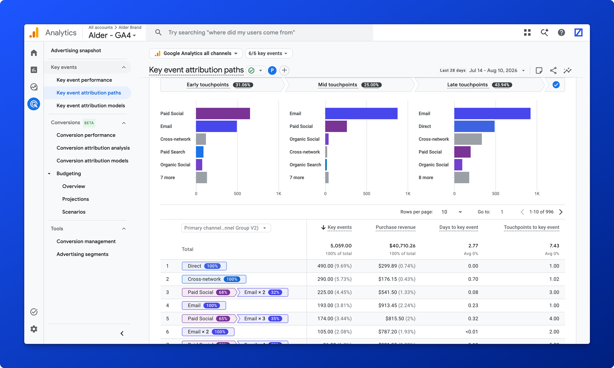
The advertising section (20:29) sits outside reports and explorations, and it is where the attribution story becomes legible. Switch the key metric at the top, open attribution paths, and you can watch how purchasers are influenced early, middle, and late in the path, and how credit gets distributed across it. Someone arriving from paid social followed by three emails splits roughly thirty-seventy. Someone arriving from paid social repeatedly takes all of it. That is the model, visible. The same section imports cost data: Google Ads flows by default, and with a campaign ID to match on you can bring in Meta, Pinterest, or TikTok and get comparable reporting.
Finally, explorations (22:07), for the reports you want to keep or export. Table for pulling data out, line chart for spotting the moment something went wrong. Two rules keep explorations trustworthy. Do not mix data sources, so if you are working in sessions stay in sessions, and do not pull session counts alongside channel-attributed revenue. And item-level reporting will not carry the same custom dimensions as event-level reporting unless those fields are on the items array in your data layer. Which is the same lesson as everything else here: what you can pull depends on how the data was wired going in.
Three Questions and One Skill (23:38)
It was never a wall of numbers. It is three questions, where your buyers come from, what they do on your site, and what makes them buy, plus the skill of telling a business problem from broken tracking. Read it that way and every number has a job.
You can run this framework on your store this week. Where it stops being generic is your own setup. Whether your unknown traffic is a consent issue or a broken tag, and which of your two revenue numbers can be trusted, depends on how your stack is wired. We do not do one size fits all, we look at your actual configuration, work with your dev team to fix what is off, and scope the framework so your reporting holds up to the people you answer to.
Once the data underneath is sound, the next step is putting it somewhere people will read. That is what we cover in copy this ecommerce reporting dashboard, and in the Shopify executive dashboard build.
FAQs
A: Three, one for each question you are asking. Traffic acquisition for where buyers come from, engagement (events, pages and screens, landing pages) for what they do on the site, and monetization (ecommerce purchases, purchase journey, checkout journey, transactions) for what makes them buy. The acquisition overview, and the user and lead acquisition reports, are rarely where an ecommerce decision gets made unless you sell on a long consideration cycle or a subscription model.
A: Because GA4 reports the same data at the event, session, user, and channel-attribution levels, and each roll-up does a different job. Session-based reports credit the session’s source. The advertising reports apply data-driven attribution, which redistributes credit across every touch in the path using time decay, frequency, and comparable purchase journeys. A channel can read high in one and lower in the other without anything being broken. Use session data to find problems and attributed data to judge spend.
A: Unassigned means GA4 could not fit the traffic into any channel group. Common causes are the twenty-four hour processing window, a consent setting that only partly activated, missing UTM parameters, or a source (AI search is a current example) that no channel rule was written for. Open an exploration and look at what is inside before reacting. If it is a small share of revenue it is a configuration cleanup, not an emergency. A large or sudden block of it points at consent or tagging and deserves a technical review.
A: Three reasons stack up. Users can opt out of the signals that produce demographic data. A VPN or a withheld IP address places someone in the wrong region or nowhere. And GA4 applies data thresholding, so a report is suppressed unless there is enough volume in the period to keep individuals anonymous. Short date ranges and low-traffic segments hit that threshold most often. Widen the window before assuming the data is missing.
A: They are built from different fields. Item revenue sums the items array on your purchase event, while transaction revenue comes from the event’s own value. If your items array does not carry discounts, item revenue reads higher than transactions. The same gap shows up against your source system, Shopify or Salesforce Commerce Cloud or another platform, because each side counts different fall-off events. Decide which figure answers which question rather than trying to force them to match.
Sources and Further Reading
- Watch the full walkthrough on YouTube: Google Analytics for Ecommerce
- zamartz: Copy This Ecommerce Reporting Dashboard, But Audit Your Data First
- zamartz: Build a Shopify Executive Dashboard in Data Studio
- GA4 Attribution Models (Google documentation)
- GA4 Data Thresholding (Google documentation)
- zamartz: Digital Marketing Channel Interaction Attribution Models